The 2021 Atlantic Hurricane Season is underway, and like the prior 6 years, things got started a bit early. Tropical Storm Ana (below) has come and gone, and although it formed unusually far east for a May storm, its non-tropical origins are more common this time of year. Ana formed from a low over the Central Atlantic that gradually underwent “tropical transition”, producing gale-force winds before eventually being labeled a Subtropical Storm, and a Tropical Storm thereafter.

Often, these tropical transition processes are accomplished by a low drifting south toward warmer waters. This would support the deep convection needed near the center of the low to form a “warm core” in the troposphere, a key factor separating tropical and extratropical cyclones. While Ana’s sea surface temperatures were fairly cool, cold air aloft helped to gradually support enough convection to accomplish a similar evolution, a process that ultimately took a couple of days.
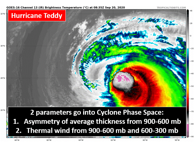
So how can we visualize this evolution, which is often gradual and subtle? One way is through the Cyclone Phase Space (CPS), developed and maintained by meteorology professors Bob Hart at FSU and Jenni Evans at Penn State. CPS is particularly useful in simplifying the rather complex spectrum of cyclones using just 3 parameters and 2 plots, which can be calculated from forecast model output. Let’s break it down using Hurricane Teddy from 2020 (below), one of the more picturesque cases of extratropical transition in the last several years.


There’s a lot to digest on the plot above, so we’ll start with the labels. First, “A” refers to the starting point of the cyclone in that model’s depiction of it, while “C” represents the current time, and “Z” is the forecasted end point. Depending on the model you choose (GFS, UKMET, CMC, etc.), these may be in completely different locations on the diagram and map at the top right – it’s likely that the models will handle this process at least somewhat differently! To visualize the cyclone’s evolution through Phase Space on the diagram, follow the line/circles from A --> C --> Z. The sizes of the circles, as labeled on the bottom right, represent the radius of gale force winds, simply meaning that larger circles = larger cyclones. Hurricanes undergoing extratropical transition tend to grow in size, so it’s no surprise to see the circles getting bigger as we move through the life cycle. The colors of the circles represent the minimum pressure of the cyclone. Finally, the map is overlaid with the 26°C isotherm, often thought of as a threshold sea surface temperature to support deep convection and tropical cyclones.
Now onto the CPS parameters. Notice the labels “Symmetric (Nonfrontal)” and “Asymmetric (Frontal)” on the y-axis above. In this case, symmetry refers to the difference in temperature across the cyclone, as measured by the thickness (depth) of the layer between the 900 and 600 mb pressure levels. Thickness is related to the average temperature of a layer via a meteorological equation known as the “Hypsometric” equation. Values near zero indicate thicknesses that don’t vary much around the cyclone, which can represent a couple of different cases: an “occluded” extratropical cyclone which is likely weakening due to the lack of an atmospheric temperature contrast to feed off of, or a tropical cyclone, which often exists in an environment where the sea surface temperature varies little!
So the next question: How do we differentiate between these two possibilities? This is where we incorporate our second (and third) parameter – thermal wind. In simple terms, how the strength of a cyclone changes as we move up through the atmosphere tells us about its “cold core” or “warm core” nature. Warm core (i.e. tropical) cyclones tend to weaken with height, and actually transition into anticyclones aloft, which is why we often look for clockwise rotating outflow on satellite as a sign that the tropical transition process is taking place. Notice the negative sign on the x-axis label above – with this, positive values of the 900-600 mb thermal wind indicate a weakening cyclone with height. As a result, cyclones that move into the bottom right portion of the Phase Space are more likely to be considered tropical!

The second figure (above) compares these “thermal wind” magnitudes in two different layers of the atmosphere: The 900-600 mb layer that we previously considered (lower levels), and the 600-300 mb layer immediately above. Comparing these two depicts how deep the warm or cold core is in the cyclone, which can be particularly useful in these transitioning cases. Tropical cyclones are notable for having a deep warm core extending through most of the troposphere, due largely to the warming that occurs when air sinks into the relatively clear, dry eye of a mature hurricane. In contrast, subtropical cyclones often have weaker, shallower warm cores as deep convection takes place farther from the center of circulation. An annotated GIF version of this Teddy example is included at the bottom of this article for convenience.
Given the handful of storms that formed from non-tropical lows off the US East Coast early in 2020, this tool may prove quite powerful over the next month or two before the Main Development Region becomes the focus. I’ve only scratched the surface here, so if you want to learn more, head to moe.met.fsu.edu/cyclonephase, leave a comment here, or contact me on any of the social media platforms on the “About” page of my site!